Where's the fun in accessibility?
UX is not only about the way it works, but about delight, whimsy, wit, and beauty. But when it comes to accessibility, we tend to take the term literally. Why?
Consider this question posted on the UX community on Stack Exchange:
Does including a Konami-code triggered Easter Egg negatively impact keyboard accessibility?
(Konami code, a sequence of specific keypresses, is a cheat code originating from video games. It's sometimes used as a way to trigger easter eggs on websites.)
Much of discussion focuses on how likely it is that the key sequence could be triggered accidentally. The implication is that by minimising any chances of encountering a feature, you can avoid putting in the work to make it accessible. This may be true for Konami code, but it made me wonder — instead of keeping easter eggs and bonus content neatly tucked away so that they don't break when assistive technology is involved, how often are these elements added with inclusivity in mind from the start?
We've been taught that UX is not only about function, but about delight, whimsy, wit, and beauty. But when it comes to accessibility, we tend to take the term literally: can this be accessed? Articles on accessibility focus on functionality, and the small, non-essential moments of delight are reserved mostly for mouse or touchpad users with good eyesight. What's the equivalent of a playful design for people who don't necessarily experience the visual, high-speed or animated version of it?
Any visual, hearing, motor, vestibular or other impairments I face are mostly situational, so I can't draw on experience here. I can spot creative touches that don't work well for users of assistive technologies (I'll share a few below). It's a little harder to find those that are added specifically with that audience in mind: by definition, they would likely be lost on me. But when I asked local leading accessibility consultant Jakob Rosin for his input, his examples, too, were mostly about functional alternatives, not the playful ones.
I'll cover both here. Training myself to notice these alternative features, while not strictly fun in the sense that I was going for, still helps me move away from thinking of one type of design as the default. Different representations should not be a mere means of accessing some one true default — they're opportunities to add features and creative touches that shine only in a particular medium.
Playful design as a progressive enhancement
Let's start by looking at how common playful touches can leave out users of assistive technologies.
The simplest example is anything triggered by a pointing device. Think interactive gradient backgrounds that change colour as you hover across a page, particle animations that respond to pointer speed and direction, or any non-essential hover state that doesn't also respond to a focus event. When not tied to critical functionality, these features are clearly a progressive enhancement, sometimes even intentionally a bit hidden. And you should not feel guilty for getting creative with pointer interactions! But consider the equivalent for a screen reader user — is there anything in your design that elicits the same “huh, that's neat” reaction from someone who can‘t see it?
To give an example, check out the interactive particle animation presented front and center on this agency landing page:
I do love the slow, satisfying inertia that ON has fine-tuned to perfection. It invites play. There's a competitive advantage to features like these, especially in agency land (it's a bit of a flex, isn't it). But in many cases the interaction cannot be triggered by keyboard, and there are no alternative, accessible labels — never mind that many people prefer not to encounter motion at all when browsing the web. s.e. smith writes in My war on animation:
I'm not the only one who struggles with parallax scrolling […]. It can also be tough for screen readers to work with, particularly when it's being used for something like a graphics-heavy display of data. Other people just find it annoying, which seems fair. Could there be an alternative plain or clean version of the same data, presented with the same care? […] Rather than viewing access as an imposition that narrows your options, think of it as an invitation to think outside the box.
If a touch of whimsy suits only one particular medium, could we find ways to compensate in others?
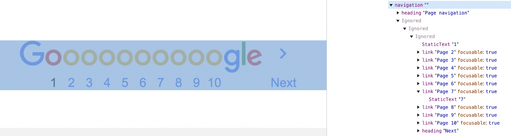
Another example is Google's long-standing design for their pagination where an o from the stretched out Gooooooogle accompanies each number in the list of results, as if to vocalise how loooooong it is. It's cute, in an Old Web kind of way. (If anyone knows where I could learn more about the history behind this bit of design, please share!) When you look at the implementation though, the play on… erm, word, is lost inside a neat list of links: Page 1, Page 2, Page 3… Functional, but boring compared to the visual.
Let's look at error pages, a quintessential outlet for playfulness in design. When you interrupt your users with an error, you probably want to do so with friendly humility. Any chuckle you can elicit with a creative illustration will soften the message more. It's curious, then, to see suggestions like the following in a guide on UX copywriting:
This is a 500 error page, so instead of the image saying something like: “Drawing of a woman screwing in a lightbulb”, it makes more sense to use “500 internal server error” as the alt text.1
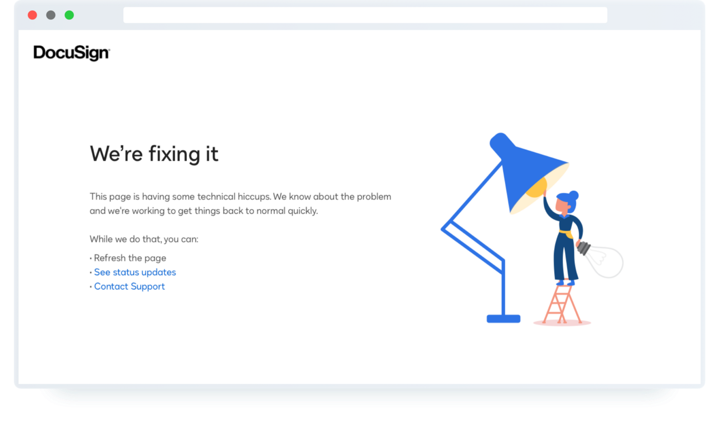
I'm not going to argue against this specific use case, as alt text is notoriously difficult to get right and heavily dependent on context. And when it comes to clever illustrations, it may just not pack the same punch. If the copywriting does much of the heavy lifting to deliver the quip, you can probably consider the illustration a bonus. But I would love to learn of examples where the overall message is just as playful for people seeing it, hearing it, viewing it zoomed in or zoomed out, and with or without images or motion.
I'd like to look at one more type of non-essential information presented visually, and that's look and feel. Serif or sans serif fonts, rounded or pointy corners, bright or pastel colours… there's a lot of tacit information that these small design choices collectively convey. But it is precisely the small design choices that I often see ignored — classed as “decorative” — when reading about accessibility. This leaves the entire burden of branding on voice & tone alone.
In The surprising truth about pixels and accessibility (an excellent overview of the long-standing debate), Josh Comeau writes:
Similarly, how about border widths? It doesn't really make sense for a border to become thicker as the user scales up their preferred text size, does it?
This is subtle, but worth challenging — why not?
Yes, we run into thorny issues around whether the browser zoom function should apply to the full page or just text2. Your unit strategy also makes little difference for users who only zoom marginally for reading comfort. For someone who routinely browses the web at 250% zoom level though, odds are they cannot make out 1px borders at all. Why shouldn't we take any opportunity to keep the nonverbal cues in our designs intact for everyone?
Consider these different uses of borders on bbc.com. Some scale with the text, some don't.
The differences are so subtle, but they provide a window into how designers reason about accessibility when it comes to non-essential content.
It's fair to say there is a disproportionate focus on visuals, illustrations and motion when it comes to creativity and playfulness. Without the lived experience, it's tricky for me to imagine equivalents in other representations. But I'd like to share a couple of examples where it has been done beautifully. Please share if you've come across others!
Playing with broken images
In How to get the most out of alt text in your marketing emails, Chris Donald talks about fun ways of leveraging alt text for people who have images disabled, or whose network connection is too slow for them to load (certainly a valid audience to consider when it comes to inclusivity).
First, it's perhaps not widely known that alt text inherits styling just like other elements. You simply don't see it unless your images fail to load and the alt text is displayed as a fallback. You can target it directly by associating the styles with the <img> element:
<img class="alt-text-fallback">

<style>
  .alt-text-fallback {
    color: var(--color-text-accent);
    font-size: var(--font-size-xxl);
    font-family: var(--font-family-display);
  }
</style>
Any CSS declarations controlling text styling such as colour, font size or family will be applied to the alt text displayed as a fallback if the image fails to load.
This could be neat for text-based images such as logos: the fallback alt text could be styled as a close enough replica of the logo, and the actual image becomes almost a progressive enhancement (remember though that the alt text should remain first and foremost a signal for screen reader users, so if your logo is a link to your homepage with the alt text “Home”, you should probably keep it that way).
Taking this idea further — and this is where we get to the easter egg ! — Chris Donald describes how Sony PlayStation sliced their hero image into separate blocks with different background colours to create fallback pixel art out of those blocks if the images fail to load:
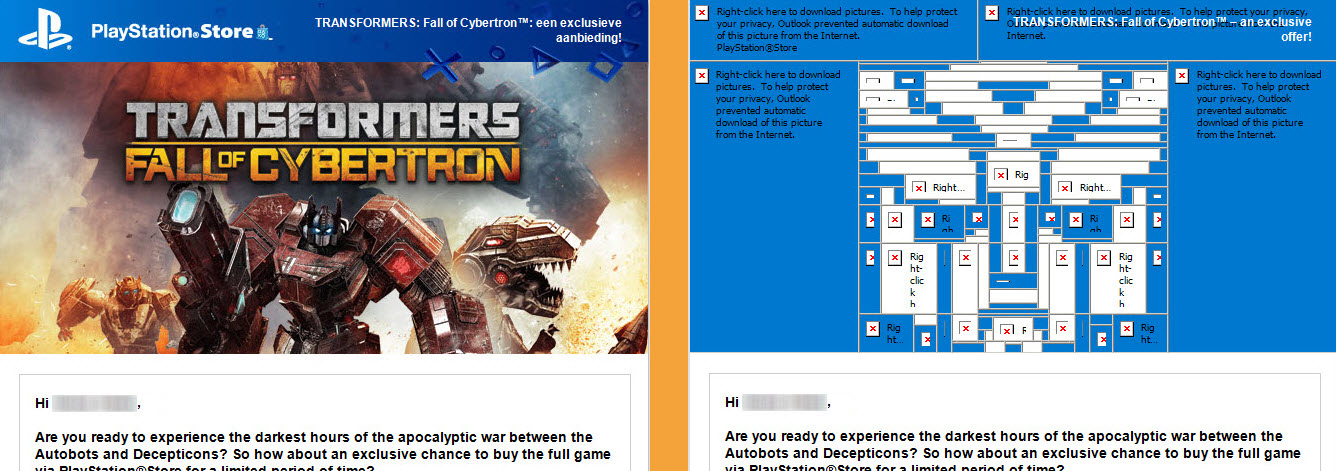
This example really captures the essence of deliberately adding alternative versions of playful touches where the standard use case (assuming images will load) doesn't apply.
And while those efforts might not be seen (nor appreciated) by the overwhelming majority of your customers, the ones who do pick up on what you've done just might appreciate it even more.
[creatures biting wetly]
I can't help but draw a parallel with closed captioning here. People with hearing loss are by far not the only ones who benefit from closed captions. Just as people on a slow connection who usually want to see images would appreciate surprise pixel art, hearing people who can't rely on audio just then will welcome well-written captions. (As a parent of young kids, I can't remember the last time I dared turning the volume up during movie night after the kids' bedtime).
“tentacles wetly squelching”
— Netflix (@netflix) July 11, 2022
Meet the wordsmiths who gave us those brilliant subtitles in Stranger Things 4 https://t.co/aFMC4c3tSe pic.twitter.com/qrCNrt4EI0
Alternative function
I mentioned earlier the distinction between alternative fun and alternative function. I've been trying my best to find IRL examples of the former, but most of what I covered here requires some imagination to fill in the gaps.
Going back to some of the examples Jakob Rosin mentioned, he focused on products that provide different functionality specifically suited to each medium. While not quite the easter egg, almost non-essential type features I was looking for, his examples highlight an interesting area of inclusive design: instead of making a feature merely accessible via different mediums, consider whether it's actually useful at all in those mediums, and provide alternatives or configuration options where appropriate.
Jakob mentions the various customisation options introduced for the lock screen on iOS 16: fonts, colour, photos, layout, and other visuals. This is fun for sighted people, possibly essential for the partially sighted, but doesn't make much sense for people who can't see the screen at all. What are the equivalent configuration options for other senses? The specific sounds your phone makes or haptic feedback it gives when locking and unlocking, for example, are not currently configurable (bar the ability to switch them off).
An example Jakob gave of a product that gets it right is Slack. In its onboarding flow, Slack asks screen reader users which order they would like to hear content presented in. For example, should the time of a message be announced before its body or vice versa? This would never make sense for people perceiving the UI visually, and that's what makes it stand out — it's a different feature, added with a different user group in mind.
We can flip this idea around. Indeed, many of the problems we face when designing for a sighted audience are not problems at all for screen reader users. For example, instead of requiring an extra action to reveal truncated labels (in tables, say), just present them in full. Screen space is not an issue here, and reading the full label is no doubt faster for the sped up synthetic voice of a screen reader than explicitly revealing a hidden portion. If you're controlling truncation in CSS with text-overflow: ellipsis, screen reader users already hear the full content as given in the source. I love this example because it makes the tooltip the alternative experience — not the ARIA label or alt text or focus state.
It might be premature to talk about playful touches when the accessibility lobby is still trying their best to get the basics down. If you're familiar with the idea of the adjacent possible, the thought that we have not only the luxury, but even the possibility to focus on fun in non-visual mediums may be ridiculous. You can't get creative with what isn't there!
Content and function obviously take priority. Still, I hope these examples sparked an idea or two. As we learn to stop viewing the visual, high-definition, high-speed experience as the default, we'll become better at noticing gaps in functionality. The fun should soon follow!
Update: 21st September, 2022
This article has been making the rounds for a while so I thought I'd share some more interesting examples of creative touches in accessible design that people have brought up as feedback. It's been encouraging to see that the landscape isn't as devoid of playfulness as I initially thought!
-
@franktalisman shared a presentation by Vasilis van Gemert on voicing animations by making screen readers sound a bit unexpected and silly.
See: Exclusive Design
-
@JoshWComeau shared his generative art tool, Tinkersynth, which gives keyboard users more control over sliders than mouse users.
See: Tinkersynth
-
As a less encouraging example, @ckundo brought up stramps — ramps that blend into staircases. You can see how the intention might have been to bring an artistic touch to something perhaps a little boring, but the result is a dangerous loss in functionality.
-
Jakob Rosin mentioned a clever way of bringing more expressiveness to team or about pages on marketing sites by adding audio clips of people's voices next to their photos.
See: Voxmate
-
Jakob Rosin also brought up audio logos — adding an alternative audio representation to a visual logo. Sonic branding is a concept traditionally more common in advertising and broadcasting, but, indeed, there is no reason why we couldn't use elements of it in digital products and services, too.
-
[2nd October, 2022] I was listening to Episode 049: Accessibility of The CSS Podcast, where Adam Argyle describes how he animates
outline-offseton focus states from a larger focus ring to a smaller one, creating a cool zoom effect when using the keyboard to tab through elements.
-
Thank you @teiresias for pointing out the ambiguousness of the chosen alt text. “Woman replacing light bulb” is probably less loaded, no matter how playful the intent :) ↩
-
I find that most sites nowadays use a mix of text only and full page zoom, but check out this 15-year old discussion on Bugzilla for a fun look into platform development history. ↩
About Elise Hein
I’m a design engineer at Plain. Previously, led design systems at Griffin, helped build products for healthcare research at Ctrl Group, worked on personal digital branding at MOO, and researched development practices at UCL for my master’s degree in HCI.